Sunday 5 April 2015

My Final Products/Promotional Products

My Music Video Product:


My Magazine Advertisement Poster Product:


My 4 Panel Digipak Product:


Wednesday 1 April 2015

Evaluation Question 1

1) In what ways does your media product use, develop or challenge forms and conventions of real media products?


Below is the research I carried out to make sure that my products would have conventions of a real life pop genre product. By doing this researched it allowed me to understand what is needed to make a product look professional and real so that my products would be successful.

Above is my research on what conventions of a pop genre music video you would expect to find. I did this so that my music video would conform to a pop genre style as much as possible. It also gave me ideas on what to include and inspired my music video in certain aspects. By looking at this research it gave me an idea to include small sections of my artist performing as well as a narrative structure, my audience survey also helped me to come up with this decision. 


To make sure that my music video would conform to the conventions of a real music video product, I decided to look at a number of pop genre music videos so that I could get some ideas on shots, framing, costume and location ideas as to where my music video could be featured. It also gave me an idea as to where each location area would feature across my time line and what would make sense for where my actors could go on their adventure. Without researching other music videos, I wouldn't know where to start and my product would probably not conform to a pop genre product.


Above again is my research of my ideas for my digipak design. As you can see I research a variety of different pop genre album covers to get an idea of what frames artists have used and what information is displayed. I also looked at deconstructing the front, back, sides and CD coverage so that when it came to making my product I would know what would be needed to make my product have conventions of a real pop genre digipak product. As well as this research, I looked through the CDs I owned and took them apart to visualize how my product would look if I was to visualize my product.


As well as looking at digipaks, I also looked at magazine poster advertisements to see what the products contained and what would be conventional for a pop genre magazine poster advertisement to look like. This gave me a few ideas on structural layout ideas and what framing techniques I would use for my own product. I decided to look at three poster designs above as these are the ones that I thought to base my idea on. There was also the Madonna poster which I liked featured in the prezi at the top of this post, which I also took my layout inspiration from.

Here is how my products relate to different theories:

Audience Theory:

The 'users and gratifications' theory looks at the motivations of the people who use media, why we watch a TV program, why we read newspapers and why we find ourselves so compelled to keep up to date with our favourite soap operas. Making the audience active as they choose what to consume and not force people into watching films, making them the ones we choose. Media industries then use this knowledge to create shows in which will either conform to this or be controversial, they respond to the demise. My products link to this theory because I have purposely created a music video in which people may be able to relate through the narrative of my video. I did this so that people would develop a personal relationship with the character in my music video, and be complied to carry on watching to escape the abuse she is receiving. Like in many soap operas, they create tension by leaving cliffhangers to therefore make the audience want to watch the next episode. I have used this technique by including a performance section within my narrative to allow breaks between the narrative and make people want to carry on watching my music video. Another reason for my music video product relating to this theory is that it also links to another one of the 4 key areas, Surveillance. I have looked at news stories of abuse in the media and noticed that within the last couple of months, and the minister of Justice going over past abuse cases which were dismissed. Also I looked over the recent allegations on celebrities sexually abusing children. With this in mind I wanted to link this news with concerns to do with the youth culture and use pop genre to display this message. I choose pop genre as it is mainly consumed by the youth/teenage culture and therefore to pass on the message I decided to encode it within my music video. The theory states 'that people feel better having the feeling that they know what's going on in the world'. The youth culture often don't realise the issue within abuse to young adults. My music video shows teenage youths struggle in an abusive relationship, with scenes of assault. That way addressing the issue within the youth culture to the youth that maybe don't know or have experienced or even know those who are experiencing it now. This can also be linked with another theories called Stuart Halls. His theory states 'that all media texts are encoded by the producer meaning that whoever produces the text fills the product with values and messages'. Multiple audiences may decode my music video differently either negotiate, oppositional or dominate way. In my audience feedback there was a few people who answered the surveys and said that they didn't like the genre so therefore wouldn't consume my product, oppositional opinion. Because of the nature of the narrative I hope that some viewers had a negotiated reading, 'the audience accepts the views of the producer but also has their own input and understanding in relation to the text'. Therefore the audience may not have the same life experiences and not understand the narrative in relation so therefore cannot relate to it in the intended way. From my audience feedback, I believe that most people encoded my product in the preferred reading that abusive relationships are wrong and that you don't have to suffer alone and you have the support of other people to help you through it.

Representational Theory:

Due to the nature of my music video my product doesn't completely comply to the Laura Mulvey 'Male Gaze' theory. Her theory focuses on 'how men look at women from those images', 'how women look at themselves from those images and 'how women look at other women'. As I wanted to focus on the message of the story the cinematography wasn't focused on angles you would show to empathise the female body and male perspective. This isn't an issue because not all narrative performances perceive women in this way. For example the music video by Sam Smith 'I'm not the only one' is an example of a music video that also doesn't comply to Mulvey's theory, Sam Smith, like my music video, includes a narrative of which the female lead is in a relationship where she is being cheated on. She chooses to spend her days crying and trying to emotional keep together while maintaining a unstable relationship with her husband. This is similar to my music video as I have a female lead who is in a relationship which she wants to get out of but doesn't have the courage to leave. However she overcomes this. The reason we both don't comply to the 'male gaze' theory is because we focus cinematography to show a narrative and a message rather than complying and focusing on angles and framing to empathise the female body. This doesn't mean to say that our videos are not successful it just means that we are able to construct something that doesn't necessarily focus on attracting the male gender. You could say that my music video links to the theorist Richard Dyer with his 'Star Theory' proposal. He states that 'icons and celebrities are constructed by industries for financial reasons and are built to target a specific audience or group of people'.The main focus for my course work is to produce an original artist;

'The exam board require you to create your own 'identity' for your artist or performer. You can use the title of the track but you must produce a new original branding for the artist or band. This must be constructed to reflect the genre and appeal of the performer'

As this was requested it means that we have to create someone who will best suit the genre we choose and therefore constructing our own 'star'. As I choose pop genre, it meant that I had to research artists of this genre and look at their career to create my own realistic artist. From researching I had to loo into costumes that you would expect an artist of this genre to be wearing and other conventions of a pop genre music video to therefore make sure that my product fitted this criteria. For my artist I looked at outfits and the way that pop genre artist present themselves towards the camera. 'A star is a constructed image, represented across a range of media and mediums', my products fit this criteria as from researching conventions of my genre and form and coming up with a new original name, a new font style to represent my artist and also creating a colour scheme to do this to create a new, pop artist. Lastly as I wanted to create a realistic, relatable narrative to my music video, I decided to look at stereotypes to associate my male characters from each other. This links to the theorist Tessa Perkins Stereotype theory, she states that 'it is not a simple process and contains a number of assumptions that can be challenged'. Because stereotypes are a good way of representing a character and making the audience aware of the behavior of someone based on a stereotype, it makes narratives easier to understand people can associate someone with the right stereotype. This can often make a unfair representation of the person as they may be stereotyped as been kind but create a sinful act making it hard for people to accept. I have used stereotypes in my music video which goes against what Tessa has said as I have used mise-en-scene and cinematography to enforce the stereotype. This makes it easier for me to engage with the audiences as they will understand the features of someone an associate them with the stereotype. For example in my music video, the antagonistic character wears black and I use low angle shots to show he is the dominant, fierce character. At the beginning and end of my music video when the character is beating up the female lead. Also to identify the protagonist male, I used stereotypes to associate the character posing no harm to my female lead. To do this I made sure my actor wore brighter coloured clothing and that the framing of each shot was at a mid level to sure inequality between the female lead and protagonist. This would then show that the audience knew when my female character was in danger with.

Narrative Theory:

My media product links to multiple narrative theories such as Tim O'Sullivan (1998), Bordwell and Thompson (1997), Pam Cook (1985), Tzvetan Todorov (1977), Vladimir Propp (1928) and Sven Carlsson (1999). My music video tells a story like said above the story is about a women in an abusive relationship who seeks the comforts of a friend to try to escape the horrors of what lies back at home. Only does she realize her problems are there for her when she returns. The abuser however leaves her which finally signify her freedom. O'Sullivan argues in his theory 'that all media texts tell us some kind of story'. In terms of my music video this is true because my music video mainly consists of a narrative of which the audience follow till the end of the music video. This theory is similar to what Boardwell and Thompson argue that music videos 'offer two distinctions between story and plot which relate to the diegetic world of the narrative'. My music video conforms to 'Fabula' part of his theory which is that 'all events in the narrative that we see and infer'.We start with the abusive relationship which we see at the start, the escapism, more abuse and the conclusion of the happily ever after.
With this narrative structure you could say that my music video has a 'linearity of cause and effect within an overall trajectory of enigma resolution' and 'a high degree of narrative closure'. All this links to the theorist Pam Cook who states that all music videos should have a standard Hollywood narrative. I believe this narrative links to a Hollywood narrative such as the 1991 film 'Sleeping with the Enemy' directed by Joseph Ruben. This films narrative structure involves a women in an abusive marriage in an attempt to break free she decides to fake her own death, but discovers that this is impossible with a controlling husband. My narrative is fairly similar other than my narrative allows my character to break free to allow the message of my music video to be told, that you don't have to suffer alone and with the help of other people you don't have. My narrative could fit into the stages of the theorist Todorov:

Stage 1 - Unstable relationship (abuse)
Stage 2 - Unstable becomes stable (escape)
Stage 3 - Recognition of change (caught been out)
Stage 4 - Action directed against the disruption (abuse)
Stage 5- Restoration (Relationship broken, change in stability)

My music video can also be linked to the Russian theorist Propp who 'concluded that all the characters could be resolved into only 7 broad character types' in the 100 Russian Folk tales he analysed. The villain can be identified as the abusive character who abuses my female lead character in my music video at the beginning and end of my video. The helper could be defined as my protagonist character who tries to help my female lead escape the abuse from her boyfriend by taking her on an adventure to different locations. In terms of how my music video is structured I can link my music video to the theorist Carlsson who 'suggests that music videos in general, videos fall into two rough groups; performance clips and conceptual clips'. My music video contains performance clips throughout, to break the narrative up into sections to make the audience continue watching to see what happens to my female character. It also gives the artist a chance to advertise her image, performance and connect with the audience. By having performance clips it gives another thing for the audience to focus on rather than having a continuous narrative. As this is also what is included with my music video that Carlsson states.

Genre Theory:

My music video conforms to the theorist Jason Mittell (2001) as he states that 'genre allows audiences to make choices about what products they want to consume through acceptance in order to fulfil a particular pleasure'. This theory stems from Rick Altman (1999) who 'argues that genre offers audiences 'a set of pleasures'. Whether this be emotional, visceral or intellectual. My video links to this theory because you are taken onto an visceral ride to see what happens to my main character and whether she can escape the wrath of her boyfriend. Audiences can also experience an emotional ride as it is offered to audiences to establish a significant response to the horror my character experiences. Also to those who have or in the process of experiencing a relationship like this. Breaching the reality and fictional aspect of my music video. You could also link my music video to the work of David Bordwell (1989) in terms of genre as he categories different themes you would expect to be included in most films/short films/music videos. Some themes directed at the youth culture include, rebellion, romance, sex, nostalgic, coming of age, and bullying. I decided to go through the route of romance and look at the horrors rather than glorifying a relationship. Similar to what the pop artist Taylor Swift does. In her Red album, she looked mainly at relationships and the troubles she goes through. As well as producing music videos that reflects the struggle, eg 'I knew you were trouble'. This is a perfect example of how she uses her music and genre to reflect on a situation she has encountered as well as what other people may of experienced.

Evaluation Question 2


Here is a diagram of how different features from each product has been included in other products. I decided to draw this diagram to show the links to each product and show how I have tried to make each product cohesion to one another:


How I made sure my product would be effective:

Font Styles-


When making my ancillary texts I decided to use the same font and colour in my magazine poster advertisement to in my digipak. This would show continuity between each product and when put together make a strong promotional package. In total I used 4 different styles of font. I used four types because when constructing my product, it worked out better this way.  I used the Mount font style from dafont.com for the album name for both my ancillary products as I thought this would be cohesive and show that both products match and therefore promote one another. I also used it for the release date on my magazine advertisement as it would make it stand out and works well together with the alum name and its release. I then used Birds of Paradise for the name of my artist on both my products again for cohesion and because I thought that the hand written style gave it a more formal approach. This would appeal to any audience not just my target audience. I also used it for the promotion of my single for my music video as I thought it would make it distinguish and also because it would stand out from the rest of the type styles in its position where it was located on my magazine poster advert. The last font I used from dafont.com was Optimus Princeps for the track list and information about the new single released. I thought it would be fitting to use this style for these sections as the text is very sharp and defined and therefore makes it stand out from the other soft text styles that I used. I then used the copyright information and information about where my product is available in the default text style on photoshop because I felt that it didn't need to stand out as such but only provide the information needed for the audience. I think that the text fonts I have used are effective because I have only used three main different types of styles and used these to complement different areas of information. I also think that it is affective because there isn't too many font styles so they don't conflict each other.

Colour Scheme - 


When coming up with my colour scheme I decided to look at the website colourcombos.com. This website was good because it gave me a range of different colours that I could look through. At first I was really unsure what combinations to look through so I decided to look at neutral colours because I already knew that I wanted artist to be in black and white on the front of my digipak design. I ended up coming up with the colours white and gold. White because it is the opposite of black and therefore will stand out against the colour, and gold because it appeared on most of the combinations on the colourcombos.com website. I also liked the colour gold because its quite a royal colour and feminine. The colour also stands out against the black background. Amongst my products I used the same colour scheme through both my ancillary texts to show continuity throughout my ancillary texts. I also did it so that when the products were viewed together, it wouldn't conflict and would looked like they all belonged together. By using only two colours, I think it makes my product effective because the writing is subtle and still stands out against the text. It also makes it look less busy and more professional because by using more than 2 colours, it can make a product to busy to look at due to the conflicting colours.

Conventions


Genre Conventions - 

To make sure that all of my products where successful I had to research the conventions of the genre I had chosen. This meant looking on Youtube at pop genre music videos and what commonly appears in these videos. Id did this because I wanted my music video to resemble one of a pop genre as much as possible so that it would attract the right target audience. At the beginning of my blog, I looked at a number of different music videos such as Katy Perry - This is How we Do and Duke Dumount - I Got you for ideas on framing, editing, mise-en-scene and whether the music video had a narrative of performance element. I did this so that I would know what would be expected of a music video of the genre I had chosen. I also didn't want to make a product which would appeal to a different genre type that what I intended. As well as looking at music videos, I also looked at different pop genre magazine posters and digipaks to see what how their products where laid out. I specifically looked at the main image and how the picture was framed so that I could use this in my own product. By looking at what is expected of a pop genre product, it helped me look at ideas on how I could display my product so that not only would it conform to a pop genre but also look pleasing to look at. Individually I think that my products are effective because I have looked into what is expected of a pop genre product to look at, and included as much of that information as possible. 

Product Conventions - 

Other than looking at genre conventions, I also looked at the layout and what you would expect to see on each of those products. For starters I looked at narrative, performance and abstract music videos which are conventional features of a music video. With this in mind, I then chose which one would best suit the genre I had chose and which song I was going to use. With that information I could then go onto what I wanted my music video to be about and whether a narrative, abstract or performance section would suit this. For my ancillary text I looked more into what information would be included if I was to make my own product. I looked at many different examples of poster advertisements which I knew I would need to include in my product for it to resemble one of a real product. From this research it has made my product effective because by looking at the design, construction and existing products, I have produced my own products that look professional and conform to the genre that I have chosen.


Below my deconstruction of my music video. As you can see I have looked at the four areas that are key components in producing a music video. Like what I did in my research, I have picked out areas and talked about why they might of been used and how it is effective.

Evaluation Questions 3

Feedback on my Magazine Poster Advert:

I decided to gather feedback on all three of my products so that I could get honest opinion on my work. Because I have worked hard and looked at my products a lot it means that I can't give a true representation of my product as I have different opinions and have a different perspective as I have worked on my products and developed them as to how I think looks right. When producing my drafts for my magazine advertisement poster, I decided to ask my teacher Tim Anderson for some advice on the technical aspects of my product and also just to have some general feedback on the design of my product. This proved very useful as he told me that I needed to include information as to where my product would be available. Before if I would've left it at that, consumers of the advert wouldn't know where to purchase the album from and whether or not it would be available for streaming ect. He also helped me choose which layout design he liked best. He suggested having all the information centralised as the reader would then only have to look down the page rather than across the page to find all the information. We agreed together that conventionally the poster advert would look better with layout number 3. From this feedback, I learnt that it is good to have somebody else's opinion as it can often influence your own whether you agree or disagree with what that person has to say.


Another way of gathering feedback which I decided to do was to send a survey to everyone in my college, which I was able to do by sending to my teacher and then she could send it to all the pupils at my college. This would give me a wide variety of peoples opinions as not everyone listens and consumes music in the same way and the same genre. I used Twitter to publish my survey so that more people would answer the survey and would give a wider audience results.


Looking at the responses to the first question on my survey, 4 out of the 13 people that took my survey said that they liked the colour I used for my magazine. I am happy those results as I was unsure on what colour to use in the first place. I then did additional research into what colours I could sue and came to the conclusion of using white and gold. I chose these colours because when constructing my product, these colours worked well together with the background and I thought the gold made my product look grand. 4/13 of those who took the survey must of agreed with the colour choices I had gone with, Out of those who took the survey, 9/13 said that they liked the main image. This backs up that the main image itself can draw the audiences attention in. In pop genre this is very important as most pop artists use their image to make people want to buy their products. Many people said that the image made the product look professional, this is good because I wanted my product to resemble one of a pop genre. Most pop genre artists are framed as a medium close up or a close up of their face. Therefore I decided to frame my artist in the same way as I wanted my product to have conventions of pop genre. Another thing that the people who took my survey said, 6/13 liked the font that I used. I was glad that so many people said they liked it because at first I thought having 4 different fonts would be conflicting and hard to read. However I know that in the next question this was pointed out. Overall this question helps me to understand what people thought was effective about my product.


One of my questions that I decided to include in my survey was what people disliked about my product. By asking this question it picks out faults with my product of which I maybe wouldn't of seen without it being pointed out to me. In total there was 4 different things that people picked out. In total I think that isn't too bad considering the things pointed out isn't too severe. Like said above, 4 people mentioned that the fonts I used where slightly conflicting. With that in mind I could maybe remove one of the fonts so that only 3 is used. This might make my product easier to read and not get confused by what the name of the album is called ect. As this was one of the points made. Another thing people picked out was the lack of colour used. I have done this on purpose as most modern poster advertisements uses only a few colour combinations. Therefore me only using white and gold. I did try however to add more colour by including the rainbow effect on the box around my featured section so that it would draw the audience to the important information. I didn't want to use too many colours on my product as this would make it had to look at and conflict my music video as the performance section has the same amount of colour as my other products. The rest of the comments was about the information on my product. By using audience feedback, someone pointed out that I had wrote the release date twice and where both different. Therefore I will have to change that so that it is more clear. I could also change the font for the magazine name for the star rating and add the user name to direct the audience to the social networking sites so they know where to find my artist.


The results for these three questions helped me to know that I have achieved what I set out to do and that was to make a product that resembles one of a pop genre culture. I have learnt from my audience feedback that my product could use a few alterations to the information that is on my product. Other than that my product is fairly successful as it appealed to the majority of the people who took my online survey. Some of which who didn't like pop genre said they would consider listening to my album just by looking at my magazine advertisement poster product. From my results I can conclude that my product conforms to the conventions of a pop genre magazine advertisement poster and that if this product was to be altered by the appropriate comments suggested it would sell to the general public well. This would be considered very important as in pop genre, popularity is the main key for becoming successful as the product would need to be successful on streaming sites for it to reach the charts.

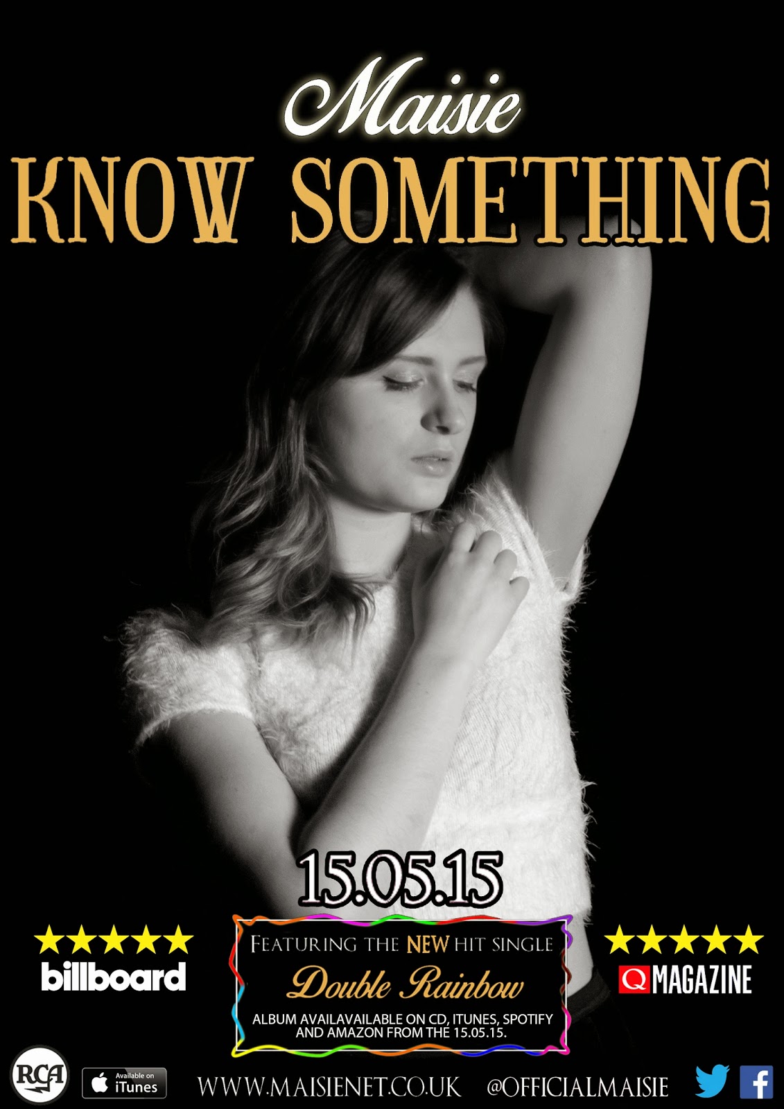
Here is my product if I was to take the advise from the people who took my survey:


To make the appropriate changes to my magazine advertisement poster, I have learnt from my audience survey what I needed to change to make my product look successful. The changes I made was to add the username for my pop artist so that it made it clear as to where my audience could find her on social networking sites. To do this I went back onto dafont.com and picked out the same text font as the website page so that it would match side by side. I then moved the website address more to the left to make room for the username to be placed in. 


Another thing that I decided to change was the name of the star rating so that it was bolder and people would see it more. Again this is what I learnt from my audience feedback as one of the users who took the survey pointed it out. I had to agree with this because I rushed putting the text on and didn't really think about the font. Therefore I decided to Google the names of the magazines and added them to more magazine. By having the same font that the magazine uses, it makes the star rating more believable and authentic. I also decided to move the date so that it is more central. Due to my models pose, it looks as though it isn't but technically it is aligned in the middle.


After that I decided to make the name of my artist smaller so that this then made my title bigger and thus stand out more. I then shuffled the name of the artist and album name to make the album name stand out more and make the artist name more distant. A few of the people who took my survey said that they didn't know if 'Know Something' was the name of the album or not. By learning what the audience expect from a product, it allows me to make adjustments to my product so that they're happy with the product. At the end of the day it is them that are going to be buying my product so therefore I need to make sure my product will sell to them. Another thing I decided to change was the release date, one person noticed that I had wrote two different release dates. This could make it very confusing for my consumers. So to resolve this, I changed the date so that they both matched to avoid any further confusion. I have learnt from my audience feedback, to check my product information to make sure that I have wrote the write things and not made obvious mistakes.


Lastly I decided to make my model bigger so that her face would take up more of the poster. I did this before because someone in the survey said that conventionally pop genre artists frame there faces more closely rather than a medium close up. Because I wanted to make her arms still in the frame, I made bigger slightly so that she would fill more of the poster as I thought there was a lot of unused space round the ages of the poster. It has also made her look more dominating as she takes up more space that in previous poster designs. Due to the help of my audience feedback, I have made my product more conventional of a pop genre magazine poster advertisement. The main image of my magazine poster is the same as the front cover of my digipak to show continuity through my products.


Through my audience feedback I have learnt that it is very important to get feedback of my product before publishing the final product because otherwise if it does not meet the requirements of the target audience, the product won't sell as well as it could. I have also learnt that by getting other peoples eyes to look at your product, they might see faults or have other suggestions of layout and information of which you maybe wont have seen. It is also helpful to see how well your advertised product would go, shown to a small number of people. You can then estimate how it would respond to a wider target audience.

Feedback on my Music Video:

While producing my music video I decided to show my 4th draft to my teachers to see what they thought of my product before I had the final draft. Even though there not whom I've aimed my product at, I knew they would give me good criticism on what I could do to make my product resemble one of a real pop genre music video. They would also give me good technical feedback on timing, editing, framing ect.


Above is the feedback I received from my media teacher Becky Ives. She told me that it would be a good idea to add effects to my music video so that it would look more professional and not look like an amateur video. With this advice I then went and explored how to add effects to my clips. Without this guidance I probably wouldn't of had a go at changing the colour of my clips. It was there that I discovered how to make the clips black and white and how to empathise the colour in the clips where she was experiencing the happy moments in the music video. Becky also suggested that I go through my clips and cut out sections that where not necessarily needed. I felt like I had to show every step of what activities they went on through my music video, but she explained to me that I could just have short sections from each activity and not have every step they take. By doing this I could then reshuffle some of my clips to make some clips longer as I thought that my video appeared have to many jump cuts for the slow song I had chosen. From this feedback I learnt to take risks and not be afraid to try something different, especially if I haven't used it before.

As well as asking my teacher during me editing my product, I asked some friends for feedback on my final product once completed. I asked them their opinion and if I they where to improve my product what would they do. For this I asked Ben Withers, Erin Miller and Jack Cracknell who gave me valuable feedback.


Ben Wither said that overall my product was good due to the structure of my music video. When I originally came up with my storyboard I was unsure at how the final video would come together. I knew that when it came to editing I would have issues with timing mainly due to the amount of things I wanted my main lead actors to do in a short time frame. Im glad that the my final video has worked well and that the balance between performance shots and narrative is right and the narrative is clear to understand on what is going on. Due to the structure of my music video, the narrative takes place during the day and the next morning. Therefore when it came to filming I made sure that my lead characters wore the same clothes on the different days of filming. Otherwise my narrative wouldn't make sense, On the next morning section, I made sure that the male lead had different clothing so that it showed that time had passed. I'm glad this was noticed otherwise people could have been confused by the narrative structure and timing. Ben also mentioned that the editing of my music video has worked well as the locational shots and costumes help make it seem as though I have filmed on the same day. I wanted to make sure this was the case as I wanted the narrative to flow effectively as possible.

Erin Miller said that she liked the effects used on my music video. Thanks to Becky advice I wouldn't of explored that as an option. Im glad that I haven't over used the effects because I was worried that I may have gone overboard with the effects. She said that she especially liked the lighting effect used on the performance section because it was conventional of a pop genre music video and she thought it made those sections interesting to watch as it added more movement to the clip. She also liked the black and white effect on the areas where she was getting beat up and the colour sections where she was happy with her friend. What i've learnt from what they have said is that by experimenting and re looking over my music video with a different outlook, can often make me things better. This is why I had so many drafts for my final video because I kept looking at my video over time and having different ideas of how I should edit different sections.


Above is Jack Cracknell's feedback on what I could do to improve my music video. The main thing he addressed was refilming certain areas of my music video. This is because in the performance section the lip sync is slightly out, and is due to the speed of my song and that when I did film these parts, the person I originally had to do it dropped out so I asked Lucy to do it for me and she didn't have long to learn it. I know that the framing for some of the performance sections isn't as good as would of liked it and if I had time I would of re shot this section. Another filming error was that in the park scenes, Nick's camera which I have used for filming, had been reformatted therefore I couldn't manually change the settings. I had to point the camera down for it to change the settings itself. Again if I had time I would re shoot this section too. What I have learnt from my feedback is to not rush when filming and make sure that I check the shots are framed accurately and leave time for re shooting.


Feedback on my Digipak:

https://cloud.gonitro.com/p/YHdLK-I-oxNg6JTPmbH3bd


What I have learnt from these two survey results is to maybe try different layouts and designs of my digipak before choosing a final design. With my digipak, I had a solid idea on what I wanted to create and maybe ignored possible ideas I could of experimented with. As I did a lot of research for my digipak, I found that I wanted to create something similar to the Emeli Sande and Sam Smiths latest albums are they where quite similar and I thought very affective, In these survey responses the response on the left agreed that this design looked professional. When I first came up with my digipak design I wanted it to look as though the black and white panels where being opened up to see the colourful panels of my artist inside. I did this because I wanted it to reflect on my music video as she breaks away from an abusive relationship to open up into a colourful new way of life. However I could of looked at other possible concepts of my digipak and include shots from my music video onto the panels rather than have the artist on the inside panels instead. 


Looking at my feedback from these two responses is that not everybody likes the pop genre of music, therefore I have learnt that you can't please everybody with your product. As long as the product appeals to the genre I have chosen and doesn't offend anyone, then my product will be successful in my opinion. The person on the right said that my product doesn't include bright colours, which he expected was conventional of pop genre. Even though this is the case, my product is more contempory using black and white to demonstrate emotion of my artist to show that my album is more soulful and meaningful than what you expect to listen to in a music video. Most popular pop genre music videos display the artist in a provocative and controversial way to draw the attention in for example artists like Nicki Minaj, Miley Cyrus and sometimes Rihanna. However my artist would be in the pop genre charts because of her music and personality for example like artists Taylor Swift, Emeli Sande, Demi Lovato. So even though you would expect bright colours, my artist and the artists listed would use the natural colours of black and white. The person on the right has said that my digipak includes conventions of the product and conventions of what she would expect a pop genre CD pack to look like. Therefore, I have also learnt that by researching existing products and conventions, helps to create a successful product which tells the audience what they need to know. For conventions of a pop genre, pop genre fans would conform to this product as my feedback has taught me so.

By using audience feedback I was able to make changes and develop my ideas of my products. For example I started with a basic sketch of what I wanted to include on my magazine poster advertisement and then from there, I looked at more products and asked for opinions on layouts from my target audience to come up with a more developed professional product. I then used Microsoft Word to produce a more structural design and look at different layout options. It wasn't until I took photographs of my artist which I could then use to feature on my magazine poster advertisement. By using photoshop I could then begin to construct a more detailed product. I used audience feedback to gather appropriate information about text fonts, an artist name and colour combinations. I also used my research to help with the decision making. I used websites such as Adobe Colour wheel and researched professional products of my genre to see what colour, font combinations they used. Photoshop allowed me to look into detail about what features I would include and I could explore the options of what I could take when producing my work.

http://molliemaymediaa2.blogspot.co.uk/2015/03/1st-mock-up-of-postermagazine.html
http://molliemaymediaa2.blogspot.co.uk/2015/03/2nd-draft-of-postermagazine-advertisment.html
http://molliemaymediaa2.blogspot.co.uk/2015/03/changes-made-to-magadvert-3rd-drafts.html
http://molliemaymediaa2.blogspot.co.uk/2015/03/final-magazineposter-advertisment.html
http://molliemaymediaa2.blogspot.co.uk/2015/03/final-advertisment.html
http://molliemaymediaa2.blogspot.co.uk/2015/04/my-final-productspromotional-products.html

As you can see from the links above, I made multiple drafts just to get to the final product. This was because I was constantly asking for my ideal target audience for information on what I might need to include and what they thought could look better if I had to change it. I also found that from my first draft to my final, I missed a lot of vital information which wasn't included in the original design. I found that I made more drafts for my magazine advertisement than my digipak because I used the image of my magazine poster advertisement as a base for how I wanted my products to cross-form synergy. As you can see from my other product I have used the same colour, font and main image for the front of my digipak and magazine advertisement.

Evaluation Question 4


Wednesday 25 March 2015

Evaluation Questions

Evaluation Questions Advanced Portfolio

1) In what ways does your media product use, develop or challenge forms and conventions of real media products?

2) How effective is the combination of your main product and ancillary texts?

3) What have you learnt from your audience feedback?

4) How did you use media technologies in the construction and research, planning and evaluation stages?

Final Music Video