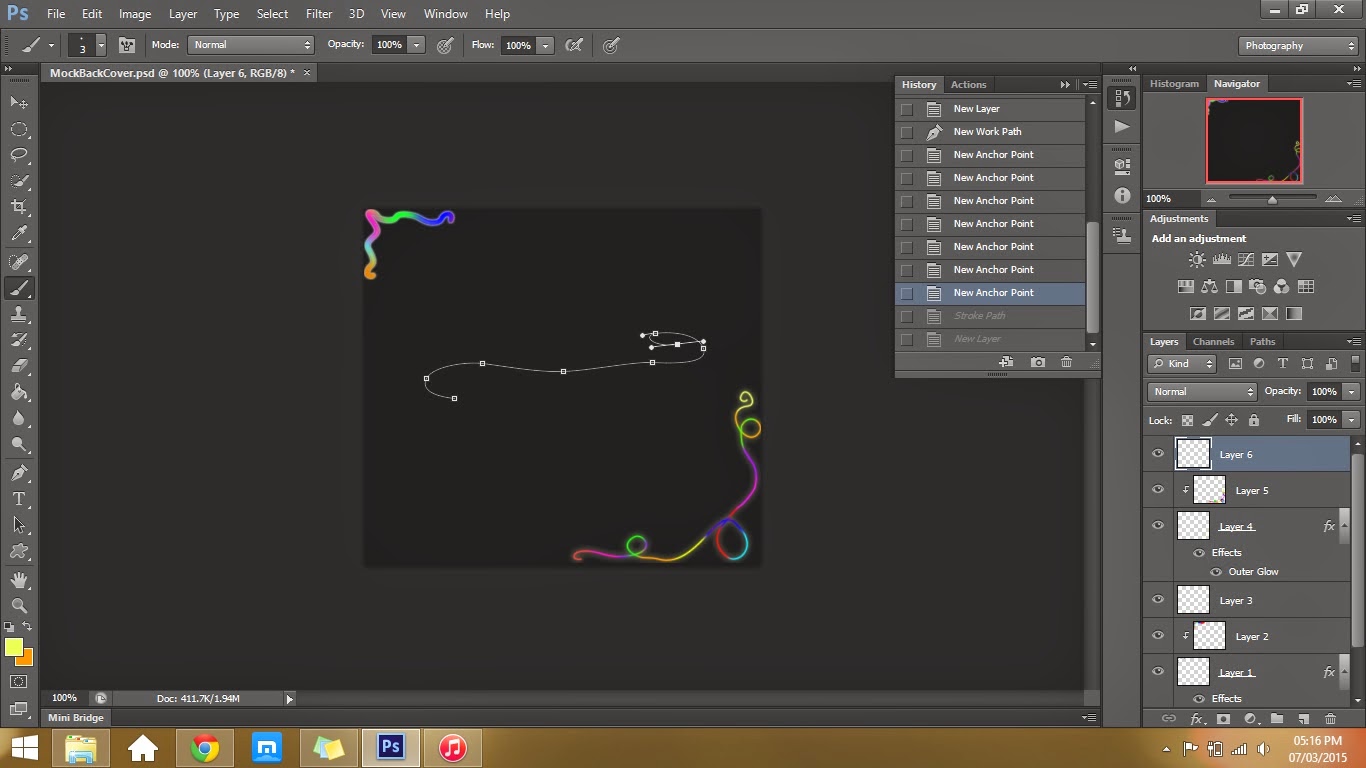
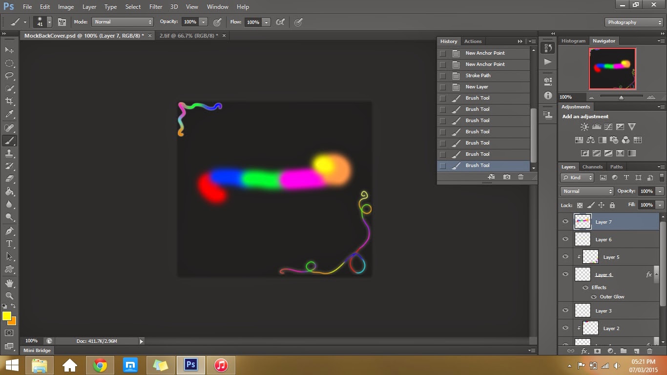
Adding Glow
Here is a Youtube clip that I used for my AS course work and while producing my digipak this idea came straight into mind. I thought that this technique would suit my album because I have used this before and prove easy to follow and looks very good. As proved with my course work product. I also think that this would look good because my music videos song is called double rainbow therefore fits well with the colours. I could use this for a pattern around the edges of my digipak or I could experiment on photographs taken from my photo shoot.
Above shows the steps of me following the video and creating my own glow
lines. I tried multiple attempts at trying to get the steps right and possible
ideas that I could address. I think that the pattern works well the smaller the
brush size is because it looks more delicate and softer than the thicker
swirls. After my photo shoot I will then see what I could do with the glow
around my artist. Again I will have to experiment with this idea further.
I like the image of the artist on these two album covers because this shot is very common in most pop genres. With both covers, the medium close ups make the artist look appealing to the audience and shows them in a dominating light. I think that if i chose a shot like this for my digipak, it would suit the album well and would be very powering. With these covers the mise-en-scene suits the text and the colour themes used. The make up used makes the first covers eyes look very irresistible and creates a strong connection with the audience.
With these two covers, I particularly like the lighting with these shots as it empathises the dramatic sense of the shot and emotions. I think this works well with the contrast between the black and white and would be affective to use this style. This is becoming more popular recently with most pop artist albums, therefore this would be affective to use if I wanted to follow this trend.
Looking at all the examples you can see that, with the exception of the Taylor Swift album, the artists name is in capitals. I might consider this and experiment with different structures and designs of material and ideas I have. This will then give me an idea of what I want to end up with, visualizing the different combinations of the ideas I have.


No comments:
Post a Comment